Rules of Photography
Rule of thirds:

The rule of thirds implies splitting an image into 9
equal pieces so basically a 3x3 grid. Then when taking
the picture you will then need to organise or place
the main subjects of the image on the lines and the
cross overs of the lines. For example in this image we
have a cheetah and as we can see it is placed on two
cross over sections of the lines drawing attention to
the viewer. The horizon is always placed on the horizontal
lines, the same applies to this image.
Balancing Elements:
The purpose of balancing elements is to help balance out
an image. If we look at an image as if it were a seesaw and
one side had more going on then the image would be
unbalanced. So we have to balance it out with something
on the other side of the picture which most of the time is in the foreground this then balances the seesaw and therefore the image.
Leading lines:
Humans when looking at an image imagine lines to help
them look at the structure. We can aid this in photography by
implementing natural lines that contrast with perspective giving a distance decay effect i.e. things get smaller the further you move away.
Symmetry and Patterns:
For the viewer of an image an image that has similarity's to
itself it is easier to see and comprehend what the image is
and so the viewer tends to like the image more than if the
image had no similarity's at all. Symmetrical sides and Patterns
are great examples of this.
Angles and Viewpoints:
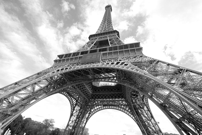
Angles and Viewpoints help us understand the shape and size of shapes and objects. For example the low angle used in the image here of the Eiffel Tower has been used to show the size of the structure to the viewer.
Background:

The background of an image can be used to show where the main subject is or concentrate the focus of the picture on the subject in the foreground. For instance a plain background attracts the attention to the main subject but a detailed background is usually used to tell the viewer where the subject is. The picture (left) shows a run down city area with graffiti and sets the scene if a subject was placed in the foreground.
Depth:

Depth can be used to but the viewers focus on a certain object in the image in relation to far away it appears to be. other "subjects tend to be blurred out or out of focus be we can usually still see what they are like in this image we can CLEARLY see the cigarette by the curb but we can still tell that there is a car on the road even though its out of focus.
Framing:

Framing is where we use man made or natural objects as frames for an image. For example this cave creates a natural frame for the image.
Cropping:

Usually photographers don't always get the perfect focused image as we have here. The reason why this appears to be a good shot is due to the fact that most of the image has been cropped out which makes us think that this was the final image where in actual fact most of the image is probably cropped out.
Experimentation:

Due to the fact that we have entered a digital age we can now experiment with trial and error more than in the past when film was the only method of photography so it was a one off. But now we can take multiple images without worry of ruining a photo as you can always delete it and take another one slightly differently.

 Shows a very detailed facial expression often used to to show extreme emotion for example anger or sadness.
  The master shot show the setting of a scene and allows the viewer to come to terms with their surroundings.
  The medium shot which is usually used on showing an individual from around 5 yards away showing their upper torso. This shows the posture and body language of the character.
 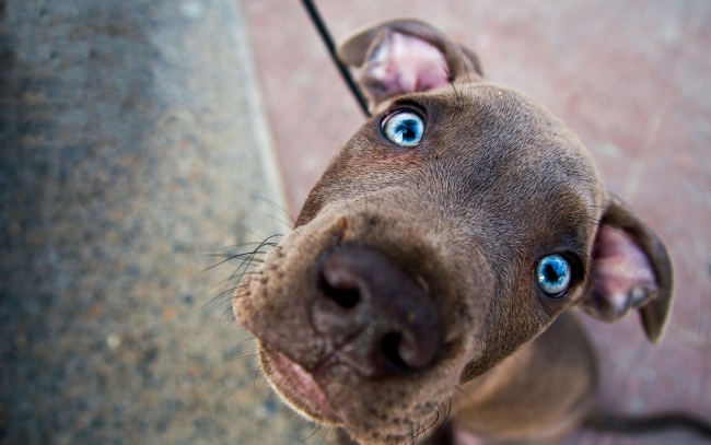 A high angle shot is used to make an object or person look small compared to their surroundings or inferior to the viewer.
 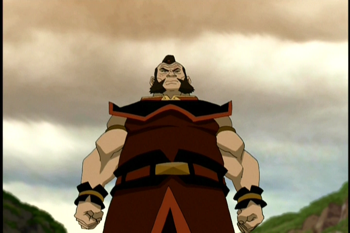 A low angle shot is used to make the subject of the image look bigger or more dominant as it makes the viewer feel smaller and therefore more vulnerable.